A Web Gallery
Objective:
There is a project called ‘A Web Gallery’ just prior to the final assignment for the Digital Photographic Practice; its aim is to encourage the creation of a photographic website/web gallery. I’ll be straight up and say that I do not intend to create such a gallery at this stage. My primary reasons are that I feel that I lack a coherent body of photographic imagery (a portfolio) and that I have no intention to market my work. That being said, I may change my find at a later date and that performing some research into what makes a successful photography website/gallery at this time would be prudent.
The primary aim of such a website is to display a portfolio of work; it is the interface with your intended audience and potential clients and should include:
- your images
- a blog (optional)
- social media (an absolute must these days)
- price list (including the option of printed output)
- client ordering (i.e. a shopping cart and order fulfilment)
- contact information (the geographic area in which you work)
The Internet is awash with photographers and their websites; it is a horribly competitive market within which to work, and where desired, make a living from. Clearly there are many different types of photographers working in numerous specialisms – landscape, portrait, wedding, wildlife, art, product, etc. and there are truly some great images out there and your photography website has to stand out from the rest of them if you are to successful.
These days there is no need for a photographer to be a computing wizz-kid and be able to design and code a website from scratch – there is an array of portfolio-building websites for photographers, including, but certainly not limited to, Photoshelter, Zenfolio, 500px and Smugmug. Part of the portfolio-building selection process includes selecting an appropriate ‘style’ that will represent you and differentiate your work from others – and reviewing your photographic portfolio to derive common aspects and a style is a good place to start and will help formulate the personal ‘look-and-feel’ that you want from your website; solicit unbiased feedback from friends and family (but be aware that these people may lack a suitably critical eye or will not be viewing the work as a potential ‘buyer’ of your photographic wares).
Before we start going through the key areas to consider, remember that the intended audience may be using a variety of ‘end-user devices’ – traditional PC or Mac, but more so now, tablet or smart phone. Whatever is decided, this is an important consideration. Given that a significant degree of online browsing is now using tablets or smart phones, your website needs to be ‘friendly’ to them as well as the laptop or desktop devices.
Developing a ‘Brand’
If you are serious to make photography your business, then you need to start devising a ‘brand’ that differentiates you and your work from the rest (business name, logo, fonts and typeface, style of writing, etc.). Your website needs to reflect your ‘brand’ and the website address will be a key part of that. It is worth spending the money to have your own domain name from the outset (i.e. mikenottphotos.com rather than something generic like my blog URL www.nott249.wordpress.com). Web-hosting services will often incorporate email services.
Website Style
You should only display you best photographic images on your website – and the supporting visual elements within the website design and layout needs to enhance rather than detract. Many of the photographic portfolio-building websites will have a set of templates that can be used – reflecting different styles and/or themes. Someone else, often with a more artistic/design flair, will have developed these using complementary colours/colour palette, backgrounds, typefaces/fonts, etc. – so why not consider them to get up and running quickly? I used a similar approach when I selected by WordPress ‘theme’ for my blog – the only difference is that I used a freebie rather than paying for it (and that does come with compromises, so consider spending some money to achieve a better end result. After all, if this is going to be the front-end of the future photographic business, then it needs to be spot-on and attract prospective clients to you and your work).
Images generally look better when viewed on a darker background rather than white. This increased contrast helps bring out the colours within an image – making it more striking. Try black and white and see what works best for you, your style and your portfolio. Having a dark background to the website will mean that the appropriate selection of colour in the text, logo, menus etc. will be important.
As a design principle, try not to use Flash and use HTML. Flash is somewhat dated now, can’t be read by Apple devices and search engines can’t read text inside a Flash website. Your website search engine optimisation is wholly dependent on text and your potential clients may simply not find a website using browser searches if Flash is used. Not a good business strategy.
Design a cracking home page!
This is the window into your photographic work and potential business; it needs to show only a limited subset of your best and strongest photographic work with the intention of making a favourable initial impact and lasting impression. Less is more and all that – you will only have a few seconds to engage with the viewer before they click and move onto the next website. Get the home screen layout right – the theme templates will usually have options for full-screen, column or slideshow displays. Whatever is selected, it needs to make an immediate and lasting impression. Search engines will use HTML text on the home screen to index and categorise your website, so make sure that the words selected are appropriate to your business and increase your chances of being picked up by Google et al.
Having an ‘About’ section/page will inform the viewer about who you are, where you work and the type of photography you work in, any awards or industry recognition, experience, etc. This needs to be something ‘personal’ as this is the only place that your character/personality may be presented and will either attract or put off potential clients! Having a separate ‘Contact’ section/page detailing telephone number, email address, social media links and postal address will allow a prospective client to get in touch with you easily. A subset of this information could also be displayed in the header/footer of the website. Setting up an e-mail contact form will increases the amount of people contacting you.
Also consider having a ‘Search’ field displayed on every page; it will make it easier to locate images within your website portfolio. Keyword use and selection is key here.
The website design will include options for menu navigation and these will also be displayed on the home page – and it will be the primary means to move around your website to locate photographic content. Menu navigation needs to be simple and straight forwards and only use single words/titles or short strings of words – as this has increased flexibility of where the menus can be located on the page.
Categorising Your Images and Presenting Them
Your portfolio of work (as does the website design/theme) needs to reflect your intended audience – that obvious, isn’t it? If your collection of images is extensive, then hard decisions need to be taken to limit what is displayed on the website; having too many can slow down the website response times and can ultimately disengage the viewer. Be discerning and only display your best work. I’ve said it before, usually ‘less is more’. The viewer can always ask you for more work if needed/interested.
Categorise the photographs into meaningful groups – by date, by subject, by category, by location, by event etc., but clearly these will be largely dependent on your subject matter/images.
Your photographs need to be sharp, true in colour and be as large as possible – coupled with quick loading speeds and ease of navigation. As mentioned at the beginning, large images need to be viewable on smaller format end-user devices such as tablets/phones, so having automatic resizing/scaling for these smaller screens is a great idea to factor in from the outset.
Use JPEG format (not TIFF) for your images, but try not to compress them too much as image quality degradation will be the end result – but a trade-off (compromise?) between quality and download speed needs to be considered and some decisions made. If you are bothered about ‘protecting’ your higher-quality images from unauthorised copying/use, then there are other ways, such as watermarking, that might be a better solution to that issue. More about that later….
Placing the strongest images at the beginning and/or the end of your portfolio is likely to have the most impact on the viewer – grab their attention at the beginning and leave them something to think about or remember at the end.
Add Shopping Cart Capability
I’m not going to dwell too much on this aspect, but if the website is going to be used to market photographic images for sale, then having an online ‘store’ capability to allow purchases to made would be fundamental; this could include a secure payment system/checkout system integrated with all major credit cards and Paypal (plus all the backend sales tax/VAT, financial record keeping and email integration for regular communications with the buyer throughout the end-to-end process).
Maintaining Your Intellectual Property Rights
Having an online presence increases the chances of your displayed images from being copied and being used by someone else without your permission or potential payment. This would be especially important if you were trying to run a photographic business where any lost revenue opportunity is something taken away from your profit. Use of watermarks on your images is one way of protection, but there is the consideration that it may detract from the overall image, so it does need to be applied carefully. A watermark is a faint/semi-transparent image or logo/company name applied over an image showing who the owner/creator is. Images are your intellectual property from the time they are taken – you own the copyright and gives you full legal rights to do with it what you will (i.e. license for reuse, sale etc.). Displaying a clear copyright notice with copyright symbol and year of publication and business name (where applicable) is key.
Add a Blog Section
To make your website more dynamic and to maintain a sense of ‘currency’, consider creating a blog section. These are dynamic in nature, but it will need to be loved and maintained with high quality content! Blog text can also be detected by search engines, increasing the potential for bringing people to your website. Don’t use the blog to just upload new images – create new text and develop a narrative style, show your personality and approach to your photography, details of current commissions/projects etc.
Review of Selected Websites:
I’m going to select a few websites of professional photographers whose workshops I have attended over the last couple of years – and see how their websites stack up against my thoughts/considerations listed above:
Aspect2i (http://www.aspect2i.co.uk/)
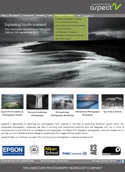
Aspect2i Home Page
The home page displays a large image panel – using a slideshow capability to refresh the image. There is a smaller panel of thumbnail images helping people to navigate to the relevant sections within the website. The menu options are clearly displayed along the top of the page and includes an ‘About’ section (called Why Aspect2i – with sub-pages), a Contact Us option, plus additional pages for various aspects of their business/work. Along the bottom of the page we have a clear copyright statement, terms and conditions/privacy policy, site map and a ‘Contact’ option with email capability. There isn’t an online payment system option, but obviously they feel that the business can operate equally well without it (payment using credit card/cheque/bank transfer is explained elsewhere).
Black text on white background works well, with accent colours on buttons aligned with the corporate logo design.
Overall, a pleasing and intuitive website that presents the business and their imagery well.
David Noton (http://www.davidnoton.com/)
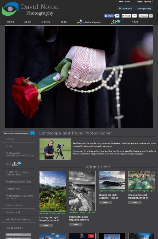
David Noton Home Page
Much like the Aspect2i home page, the David Noton website uses a large image as the primary point of visual engagement – using a slideshow capability. Menu options are displayed along the top of the page, but also an additional sub-set of options are displayed down the left-hand side. I find the over page ‘too busy’ and thumbnail images on the page somewhat distracting as the home page effectively spans two-screen depths. The standard business pages for ‘Terms and Conditions’, ‘Privacy Policy’, ‘Contact’ etc. are shown at the bottom of the page; a fully functional sales/payment system capability is integrated within the website, as is an image search function. I’ve seen better webpages….
Guy Edwardes (http://www.guyedwardes.com/)
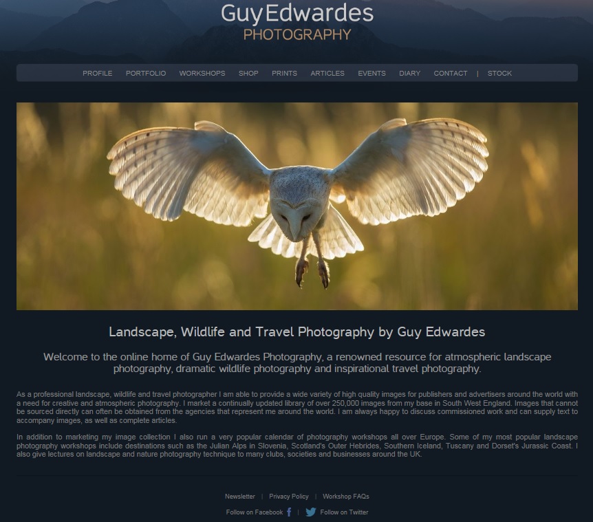
Guy Edwardes Home Page
Interestingly Mr Edwardes doesn’t have a Home menu option! I found that mildly annoying when I was navigating around the site. The dark background provides good contrast to the rotating home page image, bringing out the colour to those images quite nicely. All the expected menu options are displayed along the top of the page (except the Home page!). The Portfolio pages show the image library grouped by ‘Recent Work’ and a plethora of categories such as Birds, Landscape of the British Isles, Landscapes of the Rest of the World, etc. The images include captions, showing location or other meaningful information – and with options for buying images as prints or from Getty Images.
