I have created two documents to support this assignment submission. As I have done for the previous assignment submissions, I have incorporated my self assessment against the analysis criteria detailed in the course work in a document along with the required images.
The original document was created with two page colours – white and grey (white text on grey page can be found HERE (note – now amended) and black text on white page can be found HERE (note – now amended). Supporting Blog (Reflections) entries can be viewed by clicking the links HERE and HERE
A REVISED submission based on the tutor feedback (see below) has been prepared:
a) White text on grey page can be found HERE
b) Black text on white page can be found HERE
Assignment Five Tutor Feedback Report, including covering email text, is extracted below and can also be seen HERE:
DPP Assignment Five (Personal Project) Tutor Feedback
DPP Assignment Five (Personal Project) BoW Mike Nott 510717 FINAL 28Aug15 – with tutor comments (marked up version of the original submission that has subsequently been updated)
Tutor Feedback Covering email:
Hi Mike
I am attaching my final report and an annotated version of your supporting text.
I have been pretty nit picking but that is for a number of reasons. The work shows promise I feel and so pointing to the areas that could be improves should be of advantage to you whereas just going on about the good bits…well you know what is good yourself! The assessors might well point put things like the possibly derivative nature of the work, I know I would, but remember these are early days in your degree and there is no reason why you shouldn’t move on to a highly personal take on this as you progress.
Even if you are marked down a bit for this (and I am not sure that you will be but just in case) don’t be discouraged, see it as a spur, there is much to be pleased with in your work. You have expressed some reserve about finding your own voice at this stage and your ‘artistic’ standing; creativity is expressed in different ways by different people and you will find your niche I am sure.
Extract from Tutor Report and my thoughts/comments on them:
I have been pretty nit picking but that is for a number of reasons. The work shows promise I feel and so pointing to the areas that could be improves should be of advantage to you whereas just going on about the good bits…well you know what is good yourself! The assessors might well point put things like the possibly derivative nature of the work, I know I would, but remember these are early days in your degree and there is no reason why you shouldn’t move on to a highly personal take on this as you progress.
Even if you are marked down a bit for this (and I am not sure that you will be but just in case) don’t be discouraged, see it as a spur, there is much to be pleased with in your work. You have expressed some reserve about finding your own voice at this stage and your ‘artistic’ standing; creativity is expressed in different ways by different people and you will find your niche I am sure.
Demonstration of technical and Visual Skills, Quality of Outcome, Demonstration of Creativity
Most of what I want to say is in the comments I have appended to the copy of your supporting notes but just a few points here.
First of all let me urge you not to mount the prints for assessment. You have printed them with sufficient borders to make any mounting superfluous for assessment purposes. And the overall weight increase is really not worth the bother. Submitting your work in the usual clamshell presentation box (like these from Silverprint, expensive but will serve you well throughout your BA and beyond) is just what the assessors like as it is very straightforward to look at and so gives them the maximum time to assess the images. Added to which it is the ‘professional’ solution.
COMMENT: The time taken to add the border as part of the preparation for printing was well worth it. With regards the option for mounting (or not), it was mentioned within the written submission as the intended ‘display’ outcome as I felt that the monochrome nature of the images would benefit from the final mounting, but I understand better now what the assessors are expecting.
You could do a lot worse than to discuss in your blog the status of digital monochrome work based largely on the work of practitioners working with film. Is it desirable or even feasible to work this way or should monochrome work be done using film? There may well be no ‘right’ answers to these things but there does need to be discussion about them and a personal position taken and the reasons for this position explained. Take a look at the difference between Gregory Crewdson’s colour work with its high production values, movie style sets and crew and made on large format film and his black and white work with no lighting or crew and made using medium format (?) digital cameras. (see links below) In the colour work I suggest he is creating a fantastical world using the real world locations and in the second he is making a real world out of the fantastical world of the disused film studio…contradiction upon contradiction and the choice of medium is central to this.
COMMENT: The discussion re film vs. digital for monochrome will be a lengthy one and probably one best left for a more considered assessment, however I feel the need to make a comment here based on my tutor’s feedback. The unknown variable here is the type of camera/film option is to be considered against digital methods. Clearly digital sensors have developed immensely over the last few years and now equal or exceed the equivalent 35mm film comparisons in terms of overall resolution (previous 35mm slide film I have used in my younger days included Fuji Provia 100 and Velvia 50 – and the general view is that the resolution is 7MP and 16MP respectively); my Canon 5D Mark III is a 24MP sensor. If we are to consider medium or large format camera’s, then it’s a whole new ball game. Some research (http://petapixel.com/2014/12/18/comparing-image-quality-film-digital/) suggests that some medium format camera/high-resolution film combinations could reach between 150 and 400MP!
We also need to consider how the image is produced (i.e. electronically or optically) as there can be a great variation in the overall resolution and sharpness in terms of the level of detail, especially if large-format negatives are used – just think of Ansel Adams and the near 3D quality of his printed work from the 1930’s and 40’s and that they continue to match what is possible today.
Digital camera design and construction also limits the effective production of monochrome images; the colour-filter array used on many cameras and Bayer interpolation can significantly alter the overall achieved resolution by as much as 50% when converted back into monochrome – and monochrome work is best used for showing shape, form, texture and tone. I have used black-and-white film many years ago and spent a period of time processing and printing my images using chemicals and enlarger; it was fun and the results looked good, but it took a lot of time and was error-prone and it’s difficult to see what the real benefits are when comparing to the convenience and ease that digital now offers. I would have to go back and re-use black and white film again and look at the various options for printing before I could really comment and make a personal ‘position’ on the pro’s and con’s. It’s a good job I still have my 35mm Olympus OM4-Ti and Canon EOS30 kicking around somewhere that I can use – but perhaps experimenting with a medium/large format camera and film is where I need to be looking towards!
The size and quality of the printing is right for the purpose (I am not damning with faint praise here!), even the slight green cast does not detract from the images for my taste.
COMMENT: I was not aware of a green colour cast (and I’m still not sure I can see one), so my eye needs to be better ‘tuned’ into the nuances of visual assessment!
Am I right in assuming that these are commercially made prints? In my experience, unless one has access to very expensive professional printing machines, digital black and white printing is fraught with dangers, unpredictable colour and a tendency to a restricted tonal range being only some of the frustrations. So going down the commercial route is almost the only way.
COMMENT: Yes, I elected to use a commercial print service for this exercise and a lot of my own ‘personal’ print work. My home office is small and I don’t have the space for a high-end A3+ printer (it isn’t a money issue) – I need a multi-function print/scan for my work and that has to take priority. I may reserve the right to change my mind though at a future date – as I do like the immediacy of printing directly!
Assuming this is the case then my objection to having the text on the image may not be possible for you to do much about in the time left (not to mention the cost!), but you should talk about it at least in your blog. It would be so much better if you had left the text off and put a label on the back of the print with the name, number, photographer’s name etc. I think there should be nothing on the face of the image that doesn’t have to be there.
COMMENT: OK, this is a lesson-learned. Due to the time pressures of submitting my work for assessment I will be unable to send away for re-printing, so the assessors will have to grade accordingly on the inclusion of the name, student number etc. on the printed side. Also, if we look at the longevity of the printed work, will attaching a label using tape (?) have any affect re archival purposes? I happily attach labels to mount board as there is no direct contact with the print.
There are some very high standard images here so what I am going to say from her on in is intended as a discussion of how to make ‘good’ into ‘very good’; if you see what I mean.
It could be said that you have got very close to restaging existing images in at least some of these; your Lettuce 1 and Weston’s Cabbage leaf for example. It is difficult to see how one could photograph vegetables without this being a possible criticism but you need to be prepared for it.
COMMENT: This was always going to be a fine line – to be derivative or be utterly unique? Within the selected images I included two of ‘internals’ (plates 2 and 10) based on previous tutor comments to ‘explore’ the subject. This would have given me a differentiator when compared to the photographers researched in support of this assessment, but perhaps I should have only included ‘internal’ or ‘cut’ subjects rather than try and mix the two together within the set of images. Conversely, I could remove these two ‘internal’ images and replace them with other images to make the overall set more coherent. This is in fact what I will do and submit an amended series of images (replace plates 2, 10 and 11). I have a number of printed images that I can select from for final assessment, but I have far more images that I could have chosen from, but I don’t have the time to print them up before submission. It’s a judgement call on my part – and a slight compromise I feel.
One could argue that the tonal range is a little variable. Take your Cabbage and Cauliflower images for example. The Cabbage has a higher contrast look about it, making it feel sharper, more vibrant; whereas the Cauliflower feels softer and quieter. The result of this may be what you were after or it might seem to upset the unity of feel in the set of images (all these things you can make reference to in a blog post in response to this report.)
COMMENT: I really wanted to create a ‘set’ of images of different vegetables and fruit for each image; in practice, I didn’t achieve this. Each has their own characteristics in terms of texture (smooth, shiny, contrasty, detailed, reflective or not) and with hindsight, I do agree with my tutor that there is a range of contrast across the images. Was this deliberate? The answer is ‘yes’, but rather as an indirect consequence of the image taking, lighting used and post-processing rather than a deliberate action. I would have to select a smaller number of subjects, resulting in variations of the same to achieve a degree of consistency in terms of contrast.
One of the results of this variability is the impression that some images are sharper and more detailed than others. One might even think that the focus isn’t as pin sharp in, say, the Sliced Avocado as the Cabbage. Again be prepared for this to be questioned…do you think the focus is spot on? If not why include the image? And similar questions.
Depth of field comes in here as well. Particularly in close-ups we are always fighting this problem. One needs to use a small aperture; however, particularly with digital SRLs, small apertures lead to the loss of sharpness due to diffraction effects. (Take a look at this article). One of my tutors at college (we spent much of the first year fighting with 5×4 cameras in the studio) was insistent that is you couldn’t get the whole subject in focus (in close ups that is) you should make sure that the closest point was just in focus and let the most distant parts take care of themselves. Also it is worth remembering that depth of field is distance dependent so that only one third of it is between the point of focus and the camera and the other two thirds on the other side of it. So you should start off by focusing one third of the way into the main subject. Things were made easier for us with depth of field scales on the lenses but hey! Things are made better by using more expensive lenses and those who specialize in close up and macro work very expensive, slightly long focus lenses to maximize depth of field and sharpness.
COMMENT: I studied the avocado image carefully – both on the screen and print prior to inclusion into the final set of images. I knew when I took a knife to it the fleshy part was rather slimy and would ultimately come across as ‘soft’ in the final image. However, that is different from being out of focus. The stone/seed in the middle was pin sharp at the time of taking (I used Liveview and zoomed in to set the focus and use the depth-of-field preview to check) and I am confident that I did as much as possible to achieve focus (taken at f/13, 8 seconds with 100mm macro lens – selecting no higher an aperture than f/13 because of the known diffraction issue).
I wonder if Lettuce 2 wouldn’t be better the other way up in this set. It looks more uncomfortable than the rest.
COMMENT: The orientation was deliberate rather than accidental, but I do agree that when considered within the overall set of images, it may seem to be ‘different’ in feel. I guess it is a matter for personal preference. My problem is that I can’t get a print created with the image rotated 180 degrees in time for inclusion within the set of printed images. Any adverse markings from the assessor will have to be taken on the chin!
I am not entirely happy with the composition of the Bananas. Going out of the frame like that makes then so different from the other images.
COMMENT: Again, this was a deliberate inclusion to offer up something different from the (arguably) derivative nature of the overall set of images – so I will replace it with another image to maintain consistency.
Ok, so what am I saying overall? This is a good set of images, generally good technical quality and a good homage to the photographers, Weston in particular, you have researched. They could be said to be somewhat derivative but on the other hand it has to be remembered that you are only in the middle of the equivalent of your first year so this might not be unexpected. There is room for improvement of course but that is to be expected (I suspect that all images can be improved)…this is a learning process after all and you have made a strong statement here.
COMMENT: I was surprised with the overall positive feedback from my new tutor (my previous tutor resigned from OCA when I submitted my Assignment Four material). I do agree that the work could be considered as ‘derivative’ by some, but there are only so many ways that you can take photographs of vegetables and fruit within the overall scope and approach that I had originally planned. I did learn a lot from this personal project that I hope I can use further to develop my photography in the future. In summary, I will be replacing three images (plates 2, 10 and 11) and include three new images that are more in keeping with the set as a whole, accepting that this may further support the ‘derivative’ viewpoint.
The images presented in the assignment submission are displayed below (A3 prints have also been provided to my tutor).
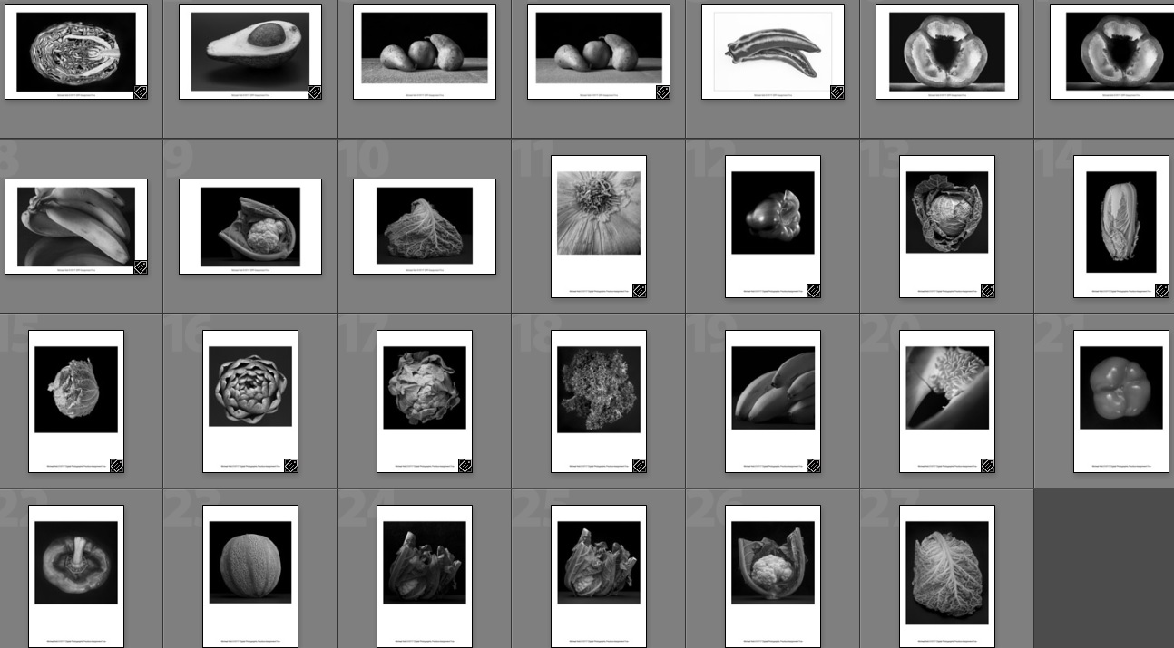
DPP Ass 5 Down-Select Contact Sheet

DPP Ass 5 Plate 1 Lettuce

DPP Ass 5 Plate 2 Cabbage 1

DPP Ass 5 Plate 3 Cabbage 2

DPP Ass 5 Plate 4 Pepper 1

DPP Ass 5 Plate 5 Cos Lettuce

DPP Ass 5 Plate 6 Avocado

DPP Ass 5 Plate 7 Cauliflower

DPP Ass 5 Plate 8 Artichoke

DPP Ass 5 Plate 9 Lettuce

DPP Ass 5 Plate 10 Pepper 2

DPP Ass 5 Plate 11 Melon